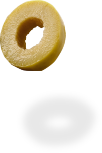
Our design strategy was based on the Company’s logo, which refers directly to its main olive product.
This logo is framed by shades of green, gray and brown, trying to highlight the interconnection of ORIGENES with both the earth and its products, such as the reed olive.

High-quality photographic shots, with minimal aesthetics, from both the Company’s final product and the olive trees and their harvest, beget to the Website’s visitors intense associations and symbolisms from the Greek rural tradition and refer directly to the ‘ ‘purity’ of the Company.
High-fidelity and aesthetic video with drone to highlight ORIGENES’s business infrastructure, as well as the natural landscape that surrounds it, all harmoniously blended.
All of this has been invested with extremely modern Web Design to demonstrate that Greek traditional products do not belong to a fossilized and stagnant past, but they can and must touch the present with a look in the future.
In addition, the Website has been invested with inspired custom icons that artistically illustrate the Company’s products, as well as the Company’s fully redesigned logo that often appears to foster familiarity and proximity to online visitors.


